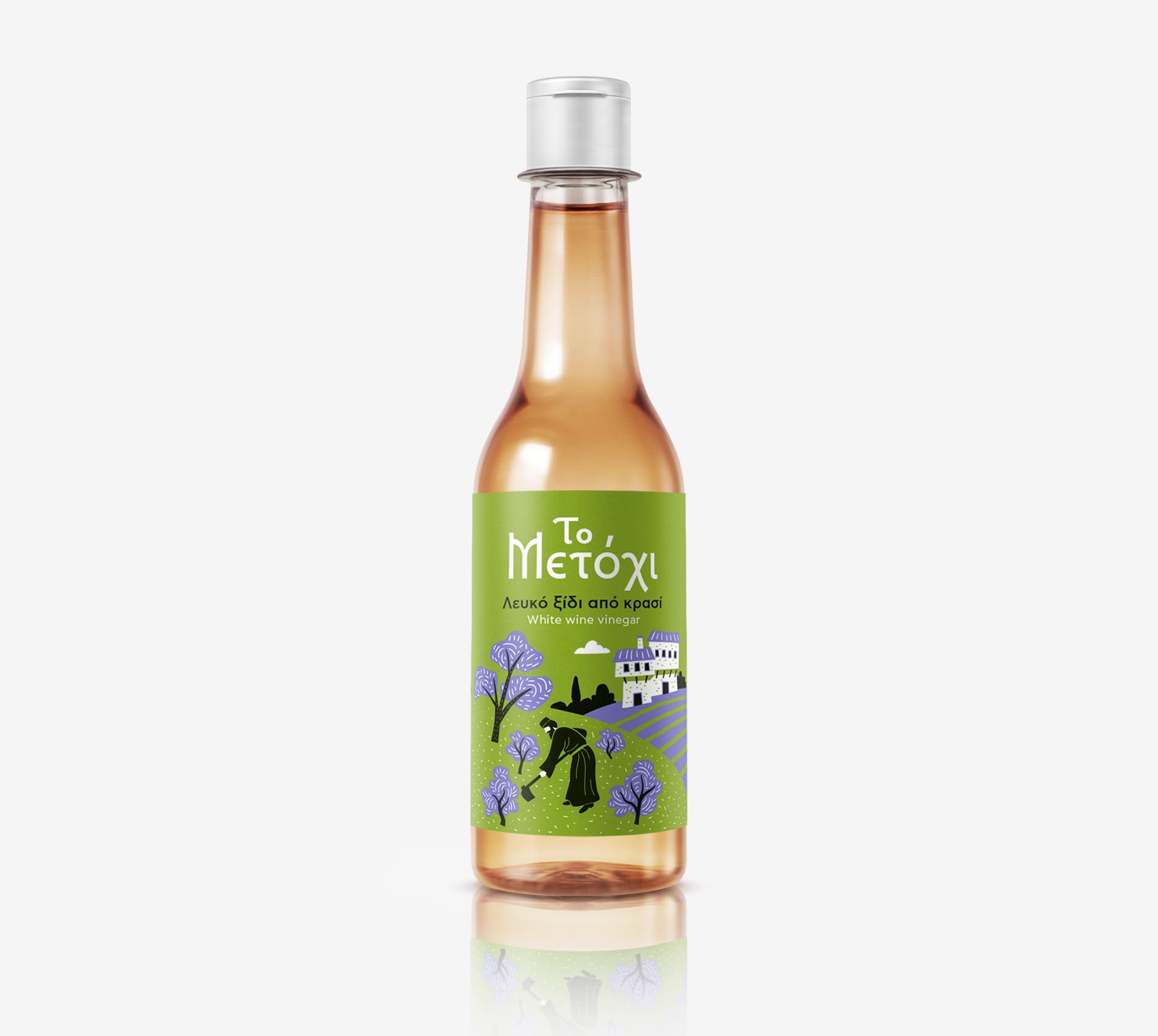
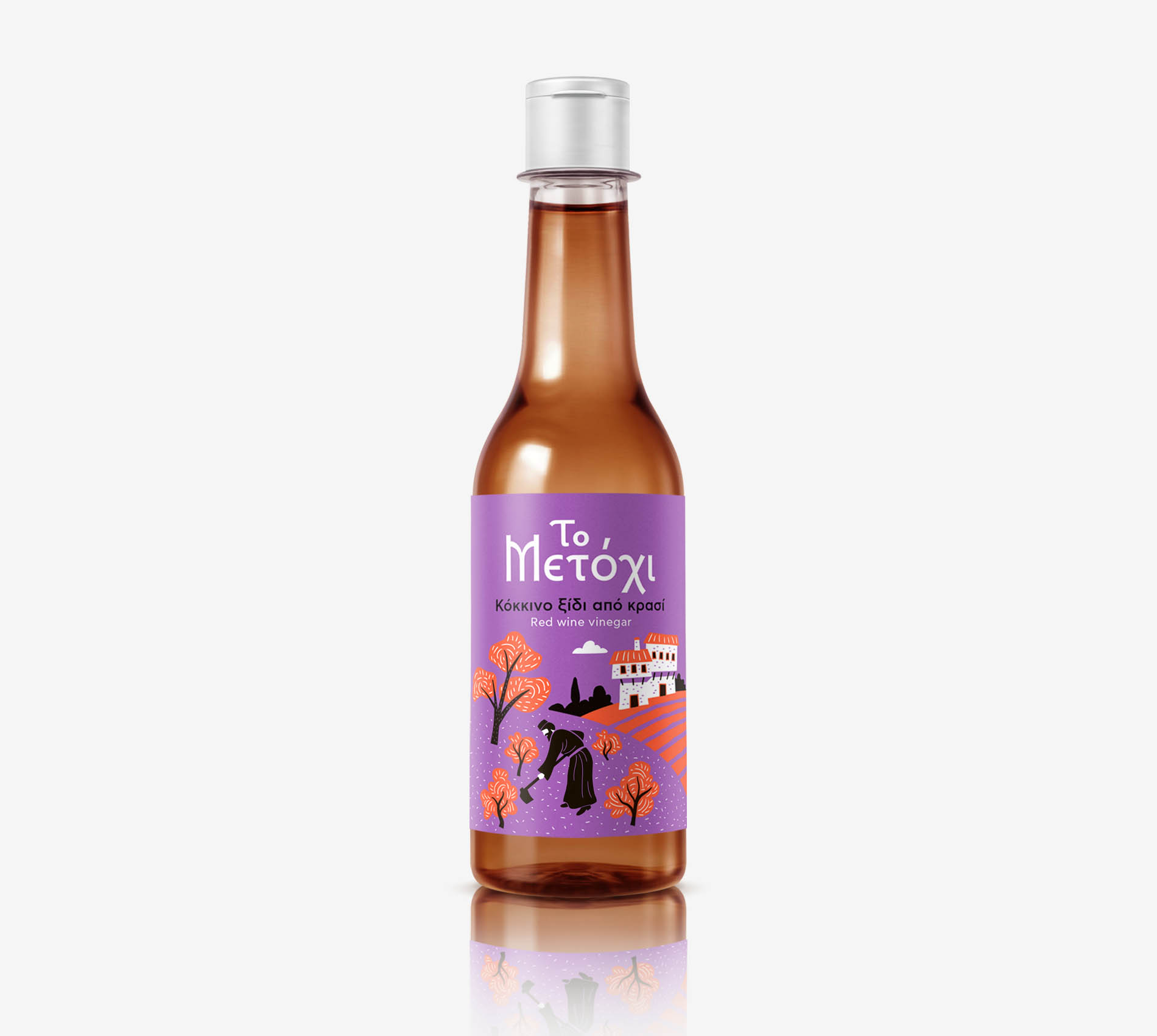
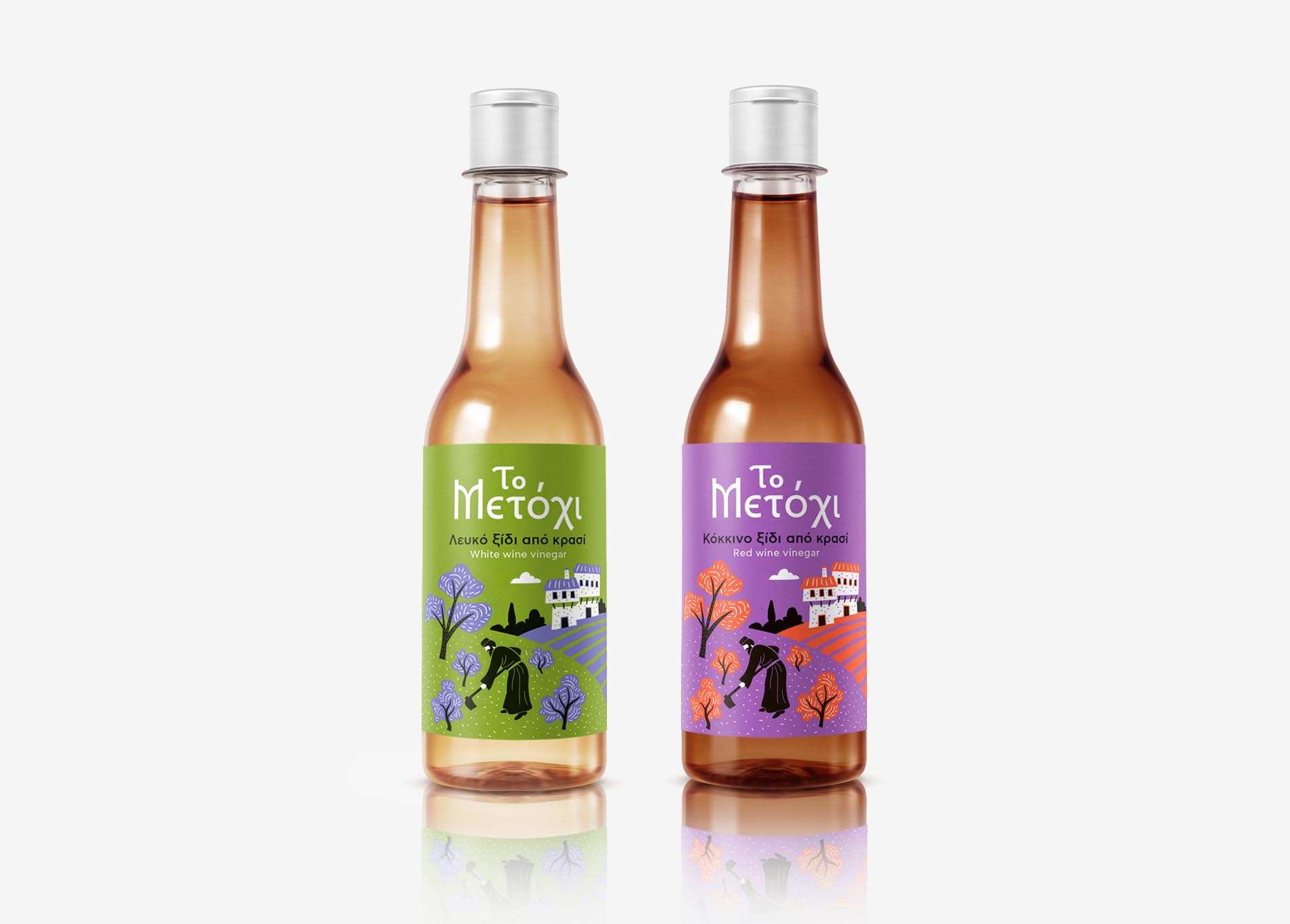
Metohi Vinegar – Label Design
Shelf standout and quality positioning among mainstream vinegars in supermarkets was the key strategic challenge of this brief.
The design needed to tell the product’s story and build superior quality in order to attract the consumer, as there was
no communication budget to support the launch.
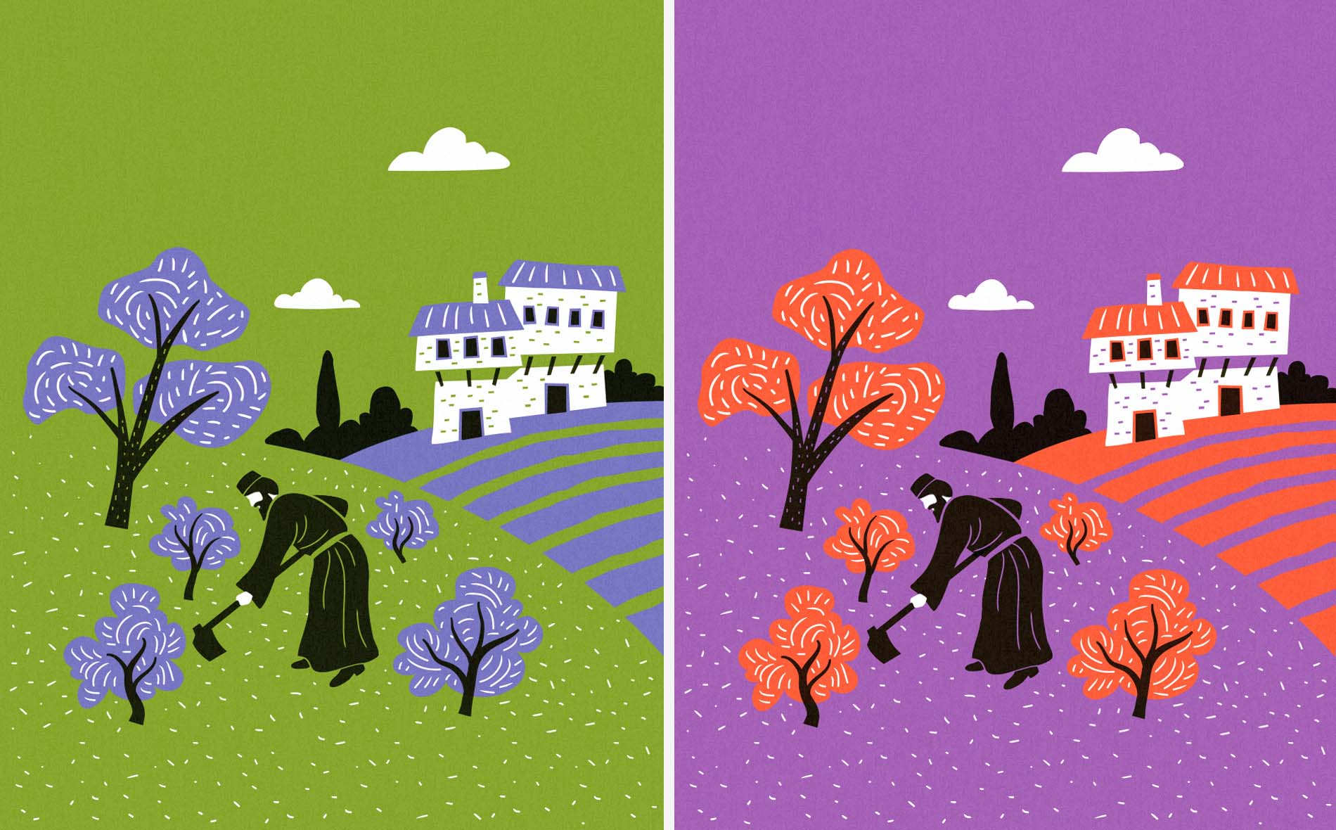
The word “Metohi” refers to a farm that belongs to a monastery and is run by monks.
As food produced by monasteries is traditionally associated with superior quality, the product’s design was based on that story.
Therefore typography of the logo is based on Byzantine letters and the illustration captures the agricultural life of a monastery.
The design style and colors were chosen for shelf standout and color-coding of the two varieties.