Pharos Resilience Ecosystem – Visual Identity & Branding
Art Direction, Branding, Graphic Design
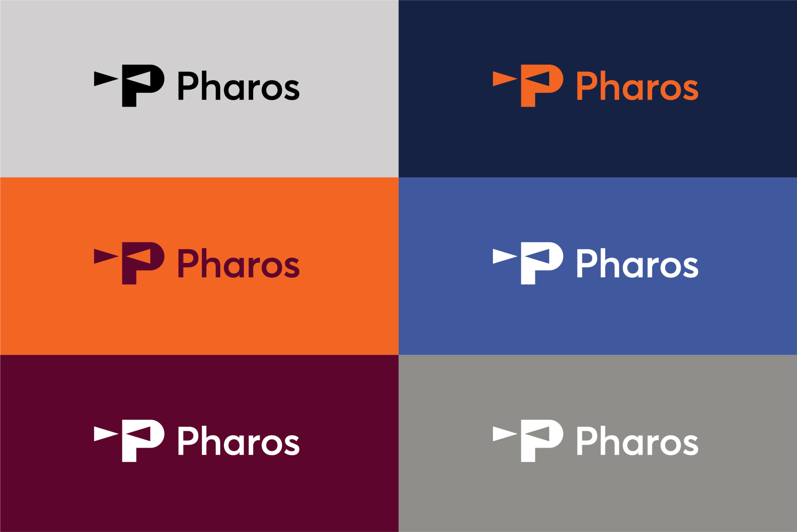
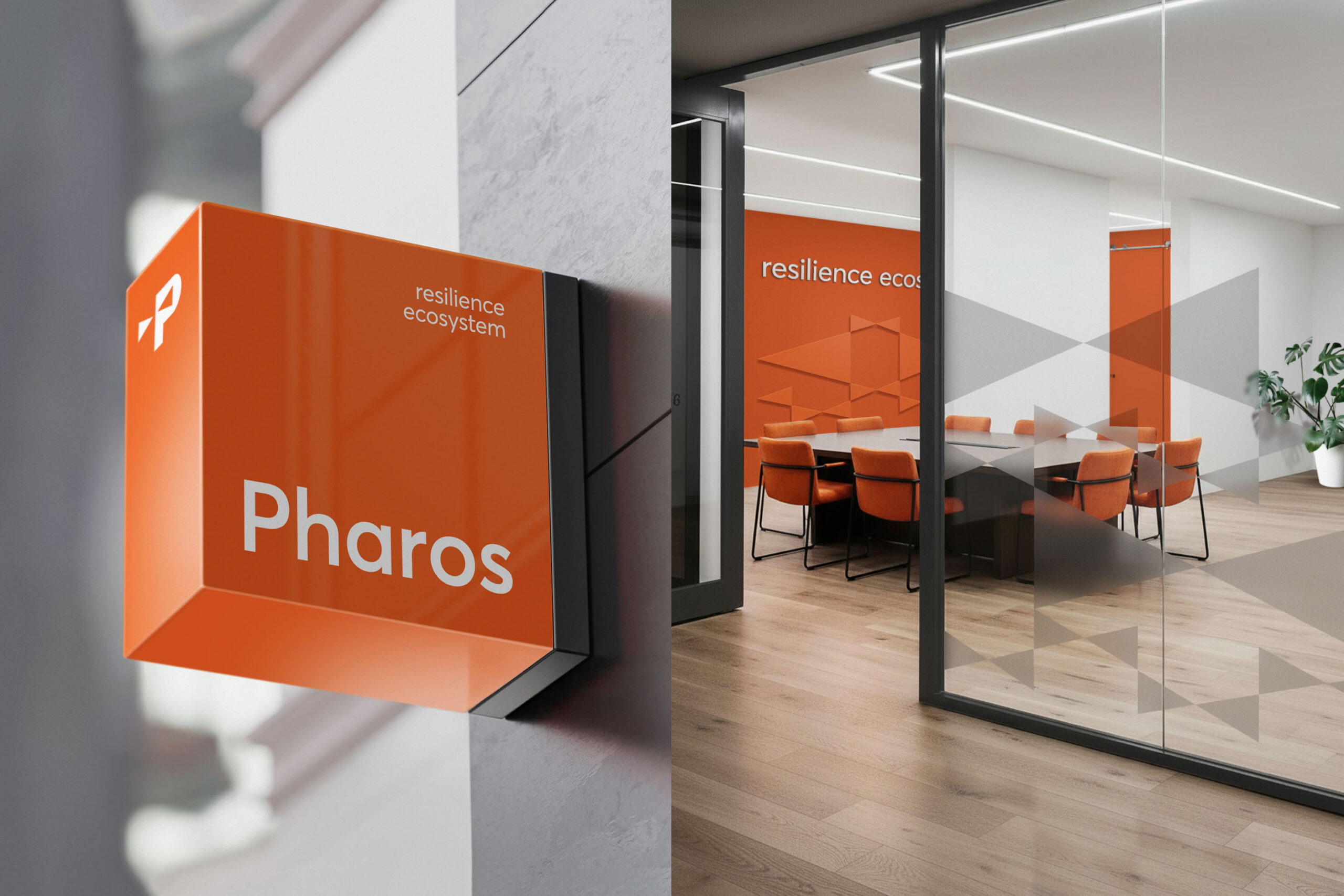
The Pharos Resilience Ecosystem is one of the few centres worldwide offering a truly holistic approach to resilience and leadership development. This project involved the creation of the organisation’s complete visual identity, aiming to build a contemporary and confident presence that reflects its role as a metaphorical “pharos”—a guiding light for the people it serves.
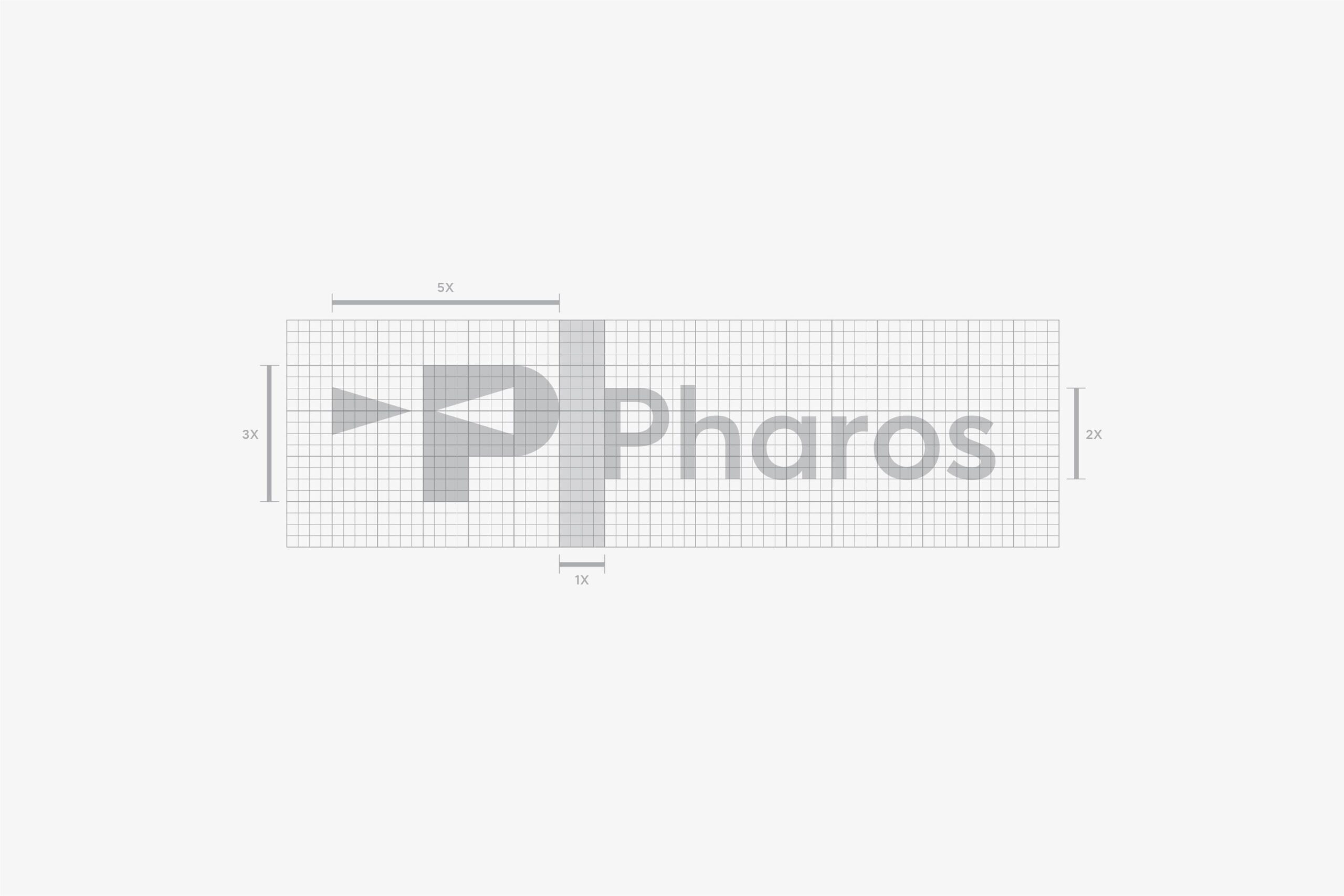
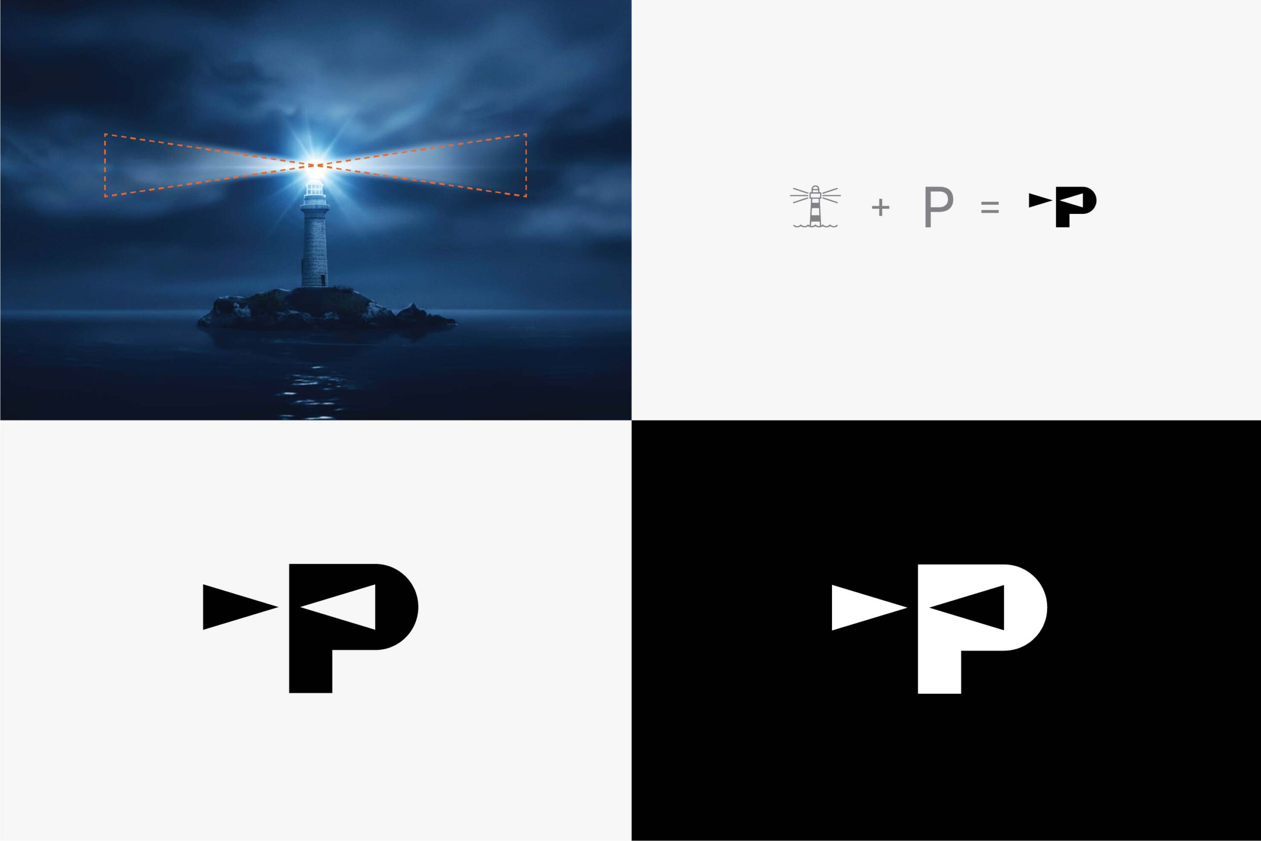
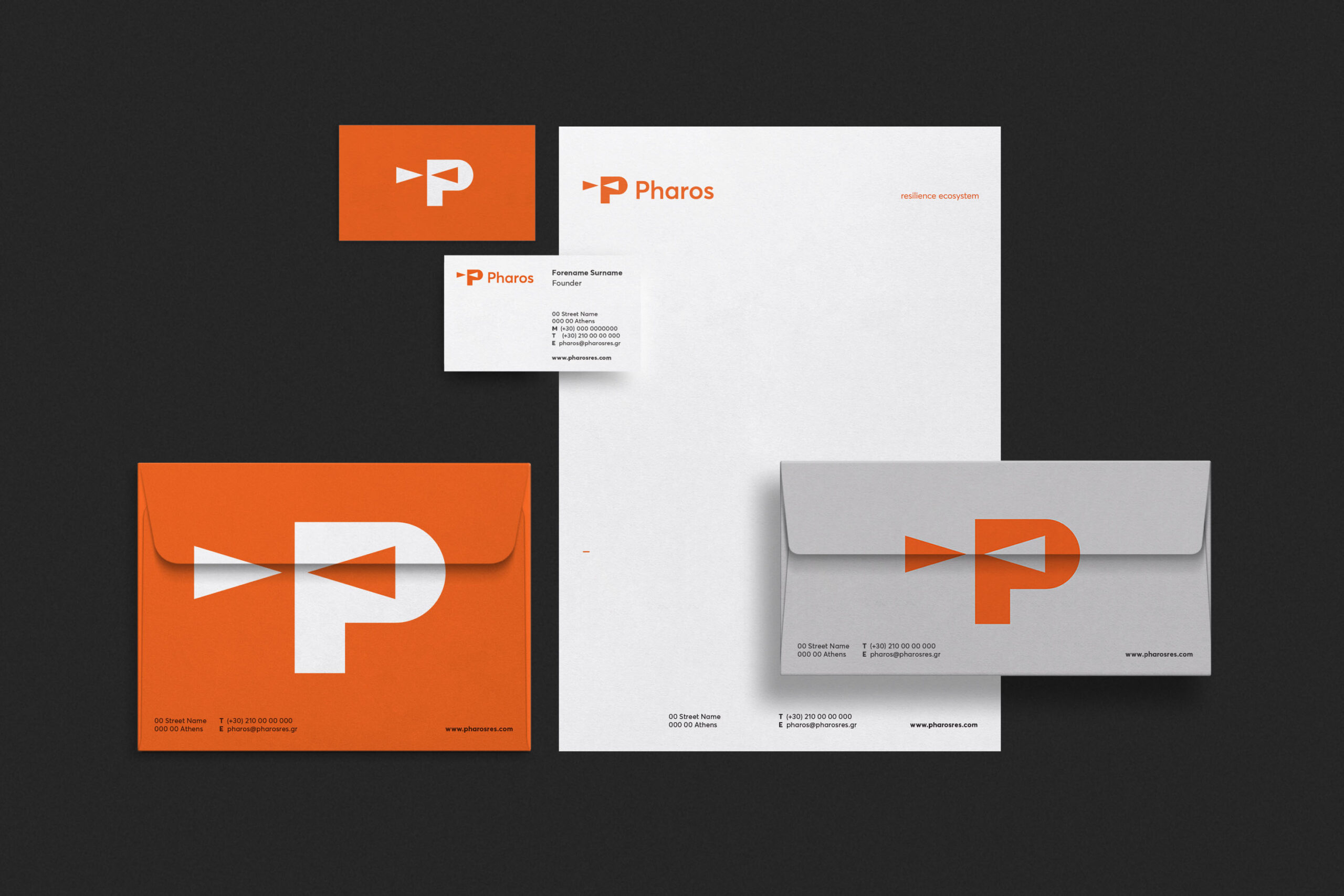
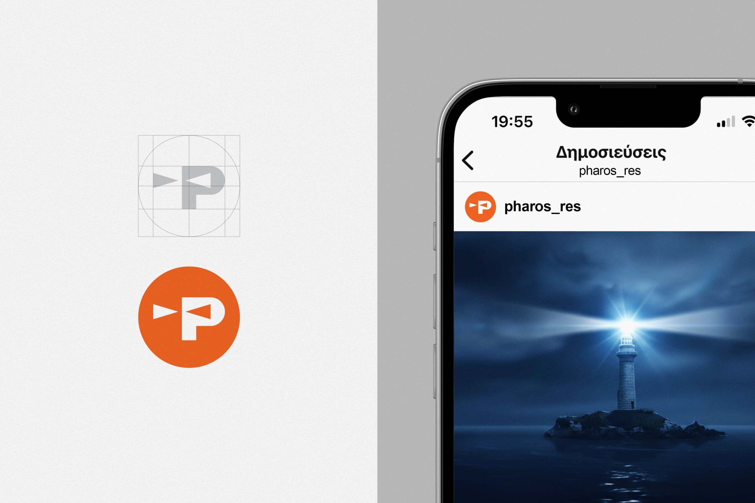
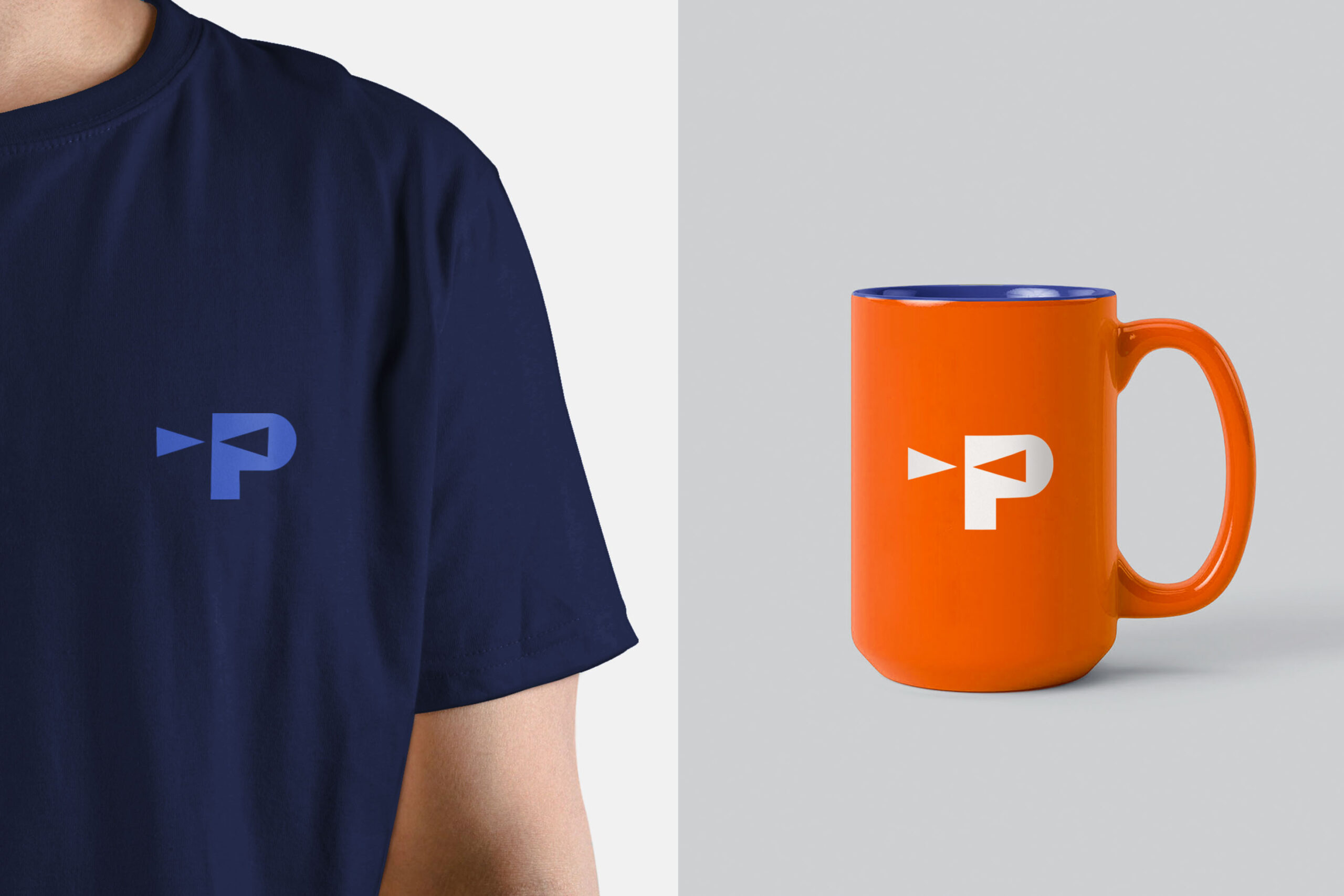
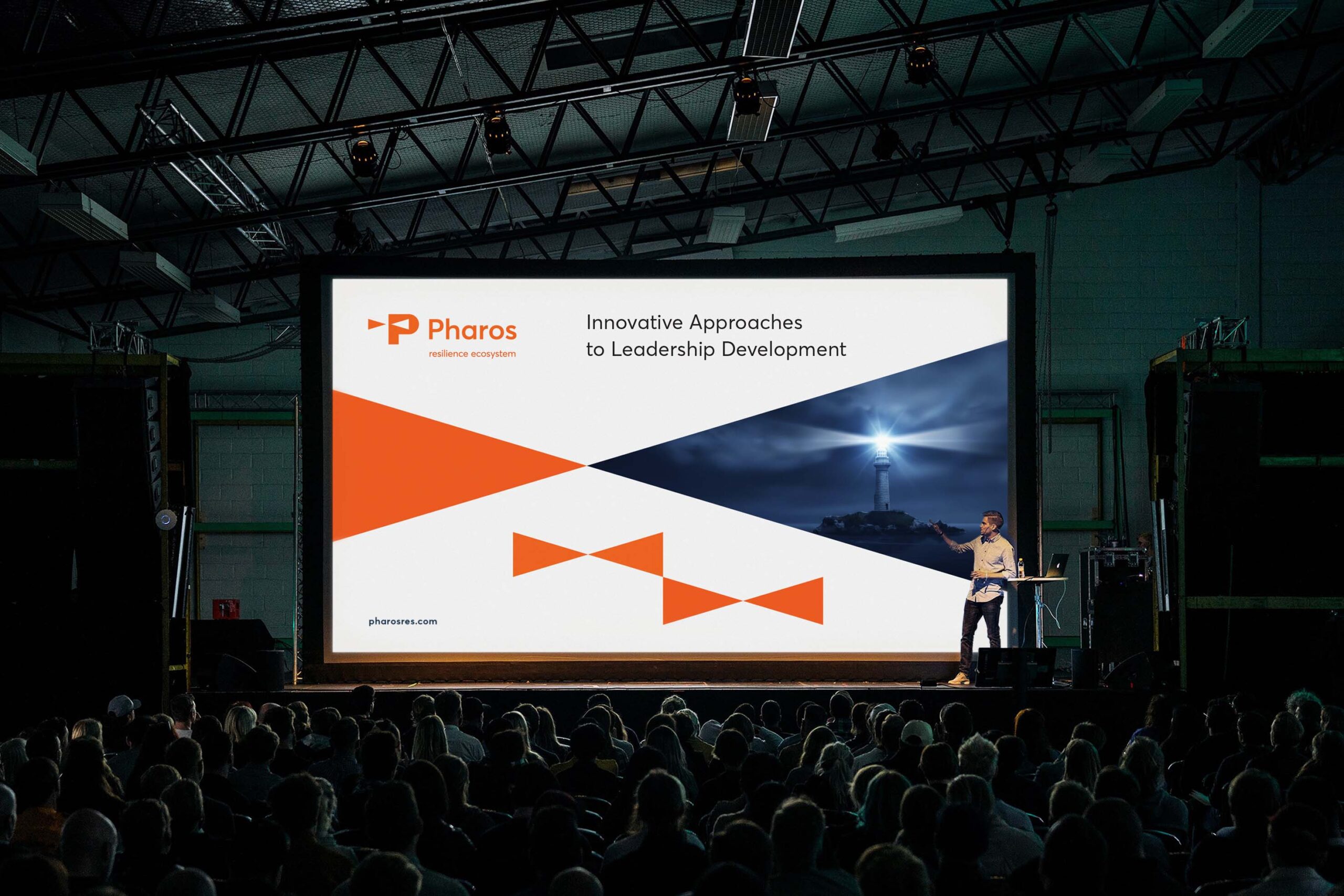
At the core of the identity lies the logo, inspired by the directional beams of a lighthouse and rendered in a fully abstract, minimal manner. Two opposing, horizontally placed isosceles triangles form a distinct and instantly recognisable symbol, seamlessly integrated into the initial letter “P” through the creative use of negative space.
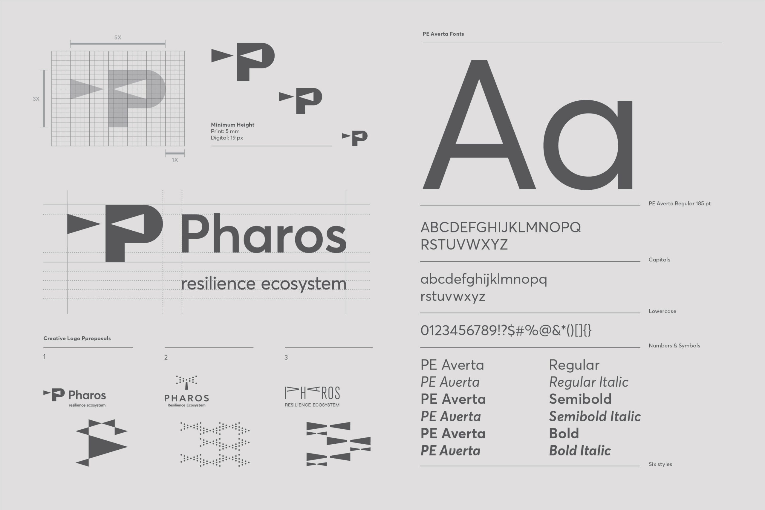
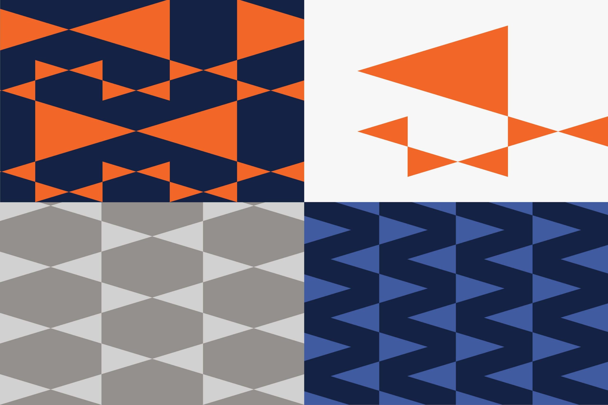
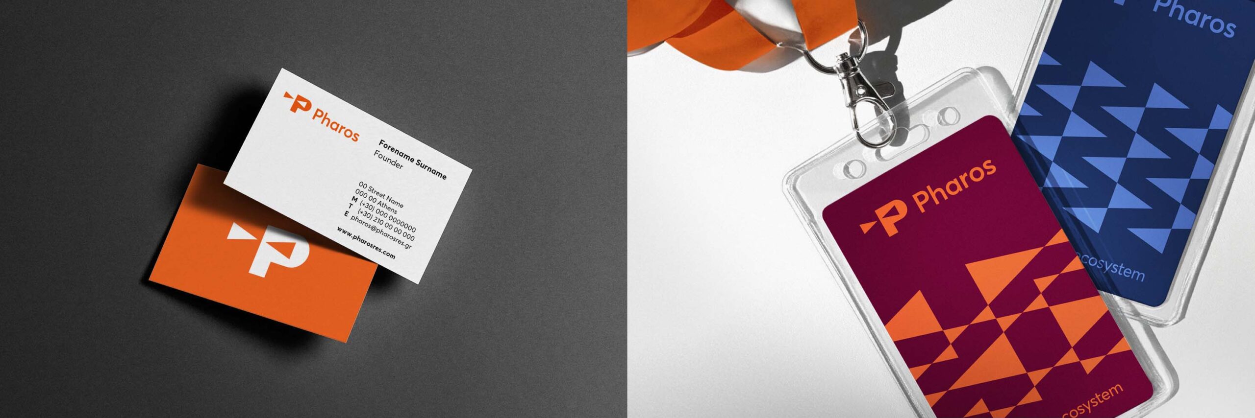
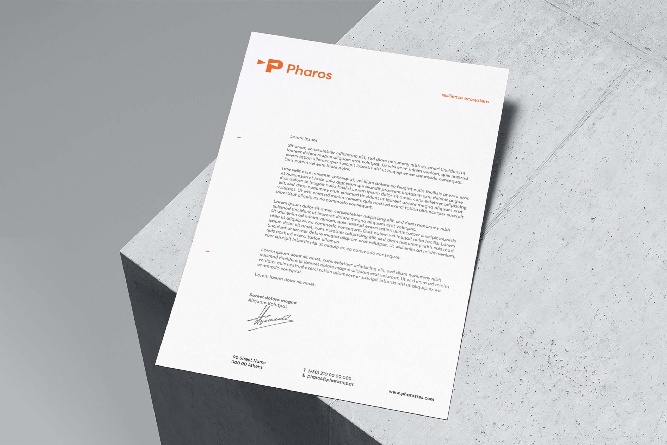
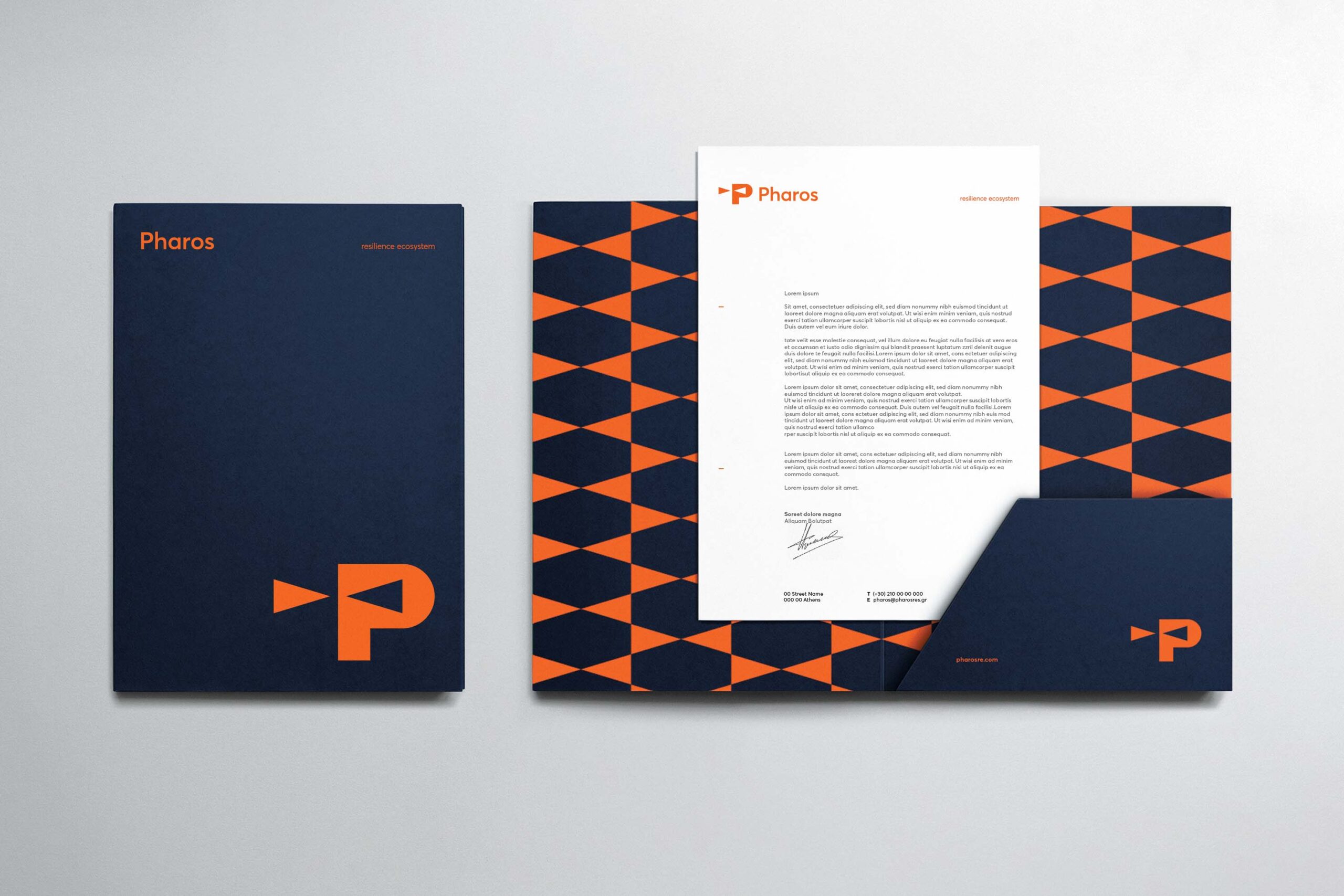
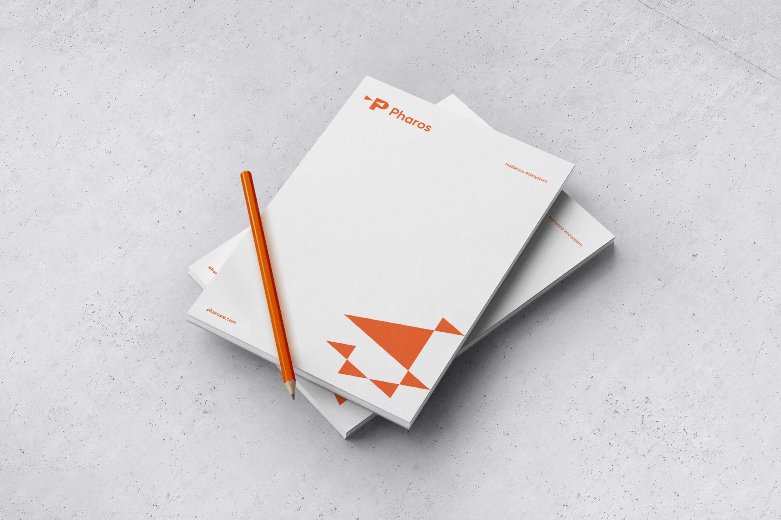
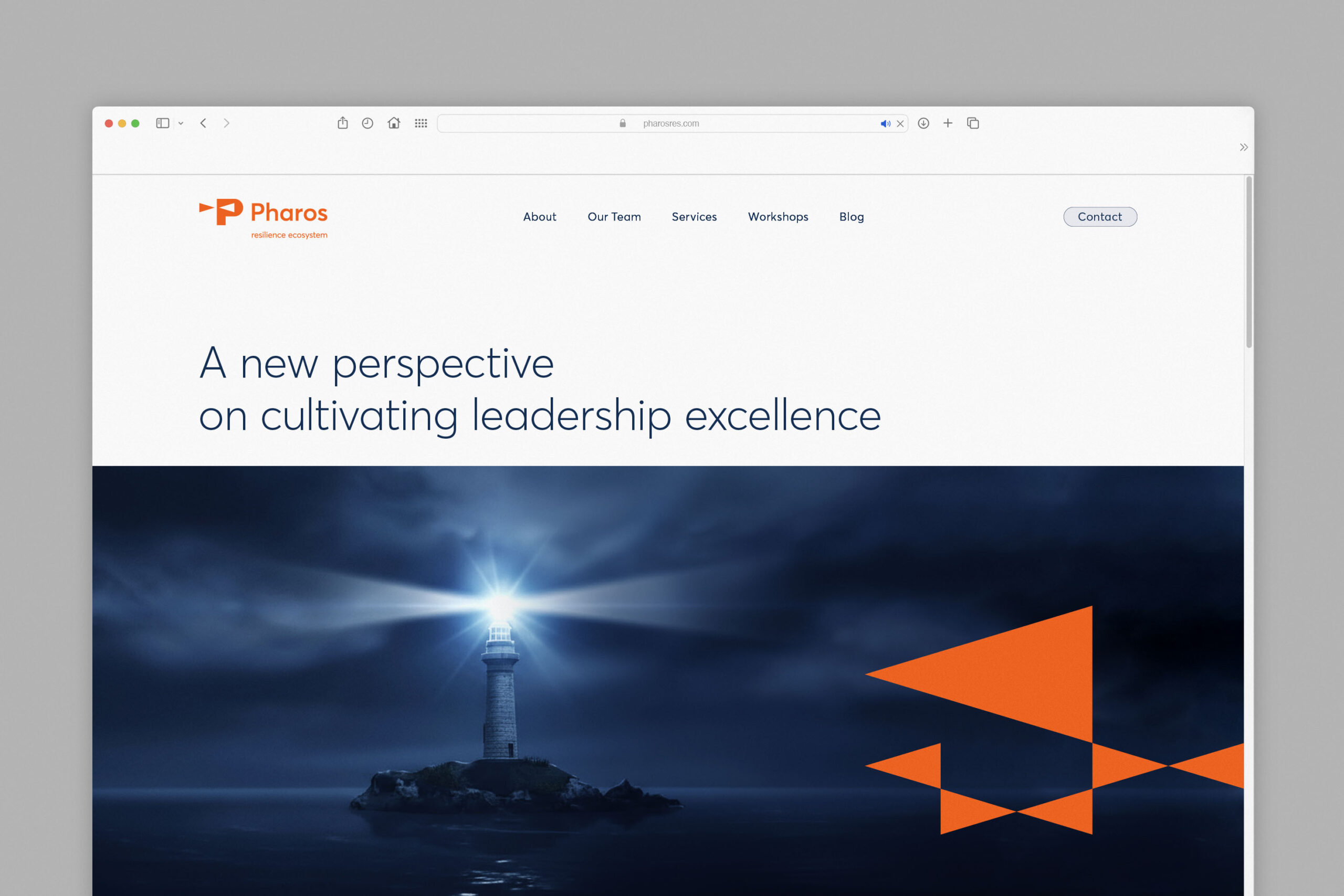
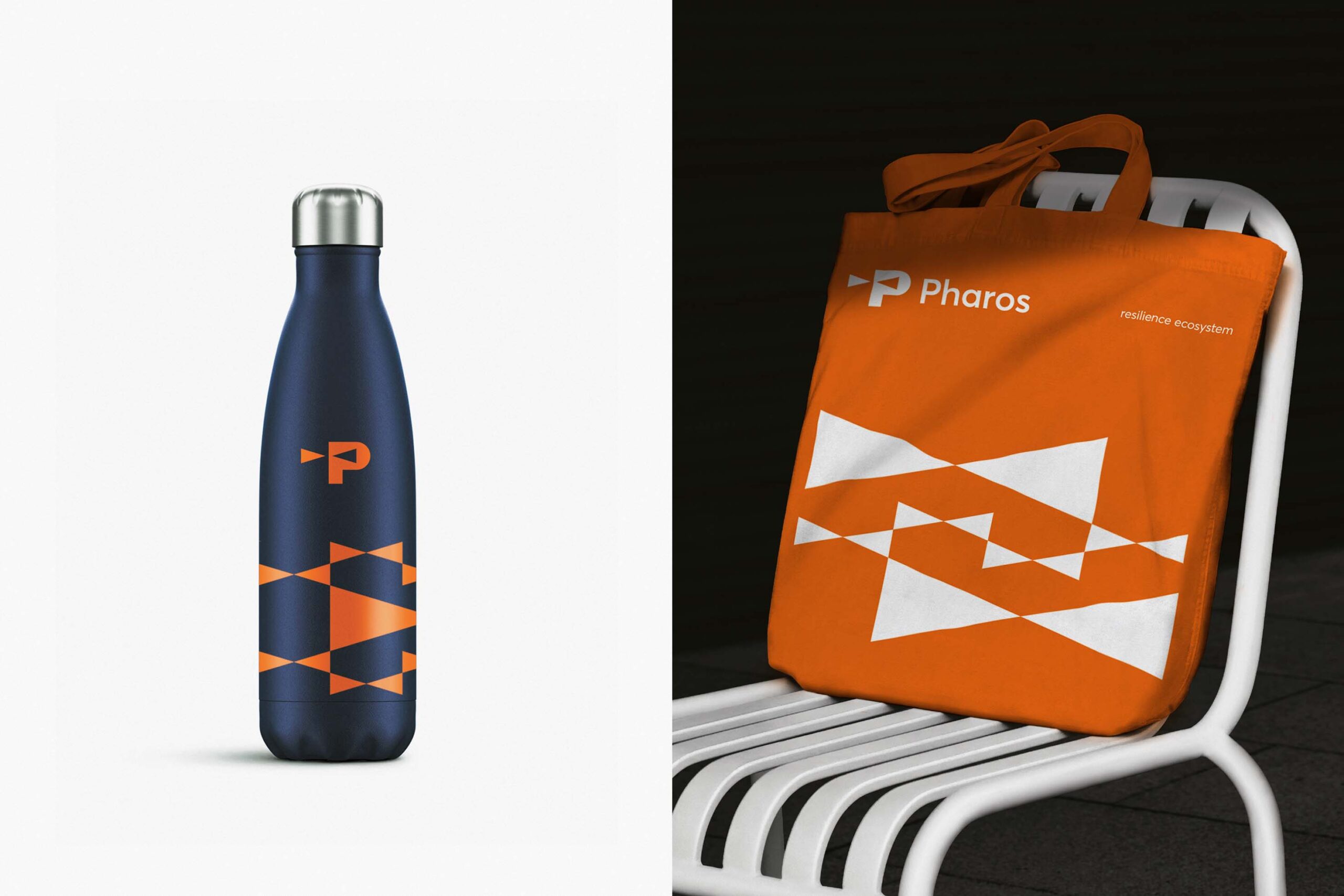
The visual identity extends far beyond the logo, developing into a flexible and dynamic system. The triangular forms evolve into geometric patterns that adapt across print, stationery, badges, digital applications, and more. The system is built not on a strict grid but on an adaptable visual language that balances consistency with movement, rhythm, and visual energy.
The result is a clean, modern, and cohesive identity that reinforces the organisation’s mission—offering clarity, recognisability, and lasting visual impact.

