Life Juices Repackaging
Art Direction, Illustration, Packaging
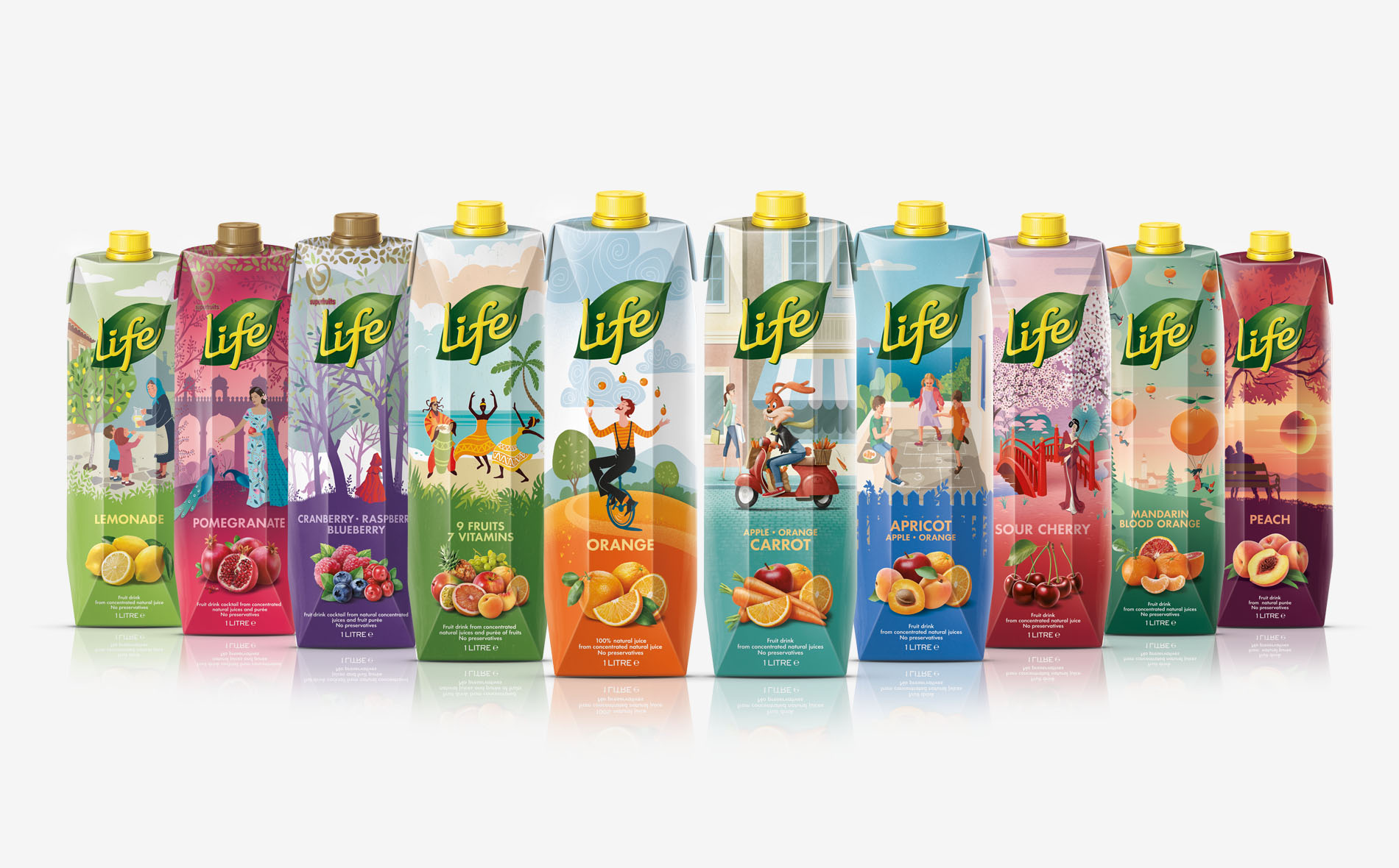
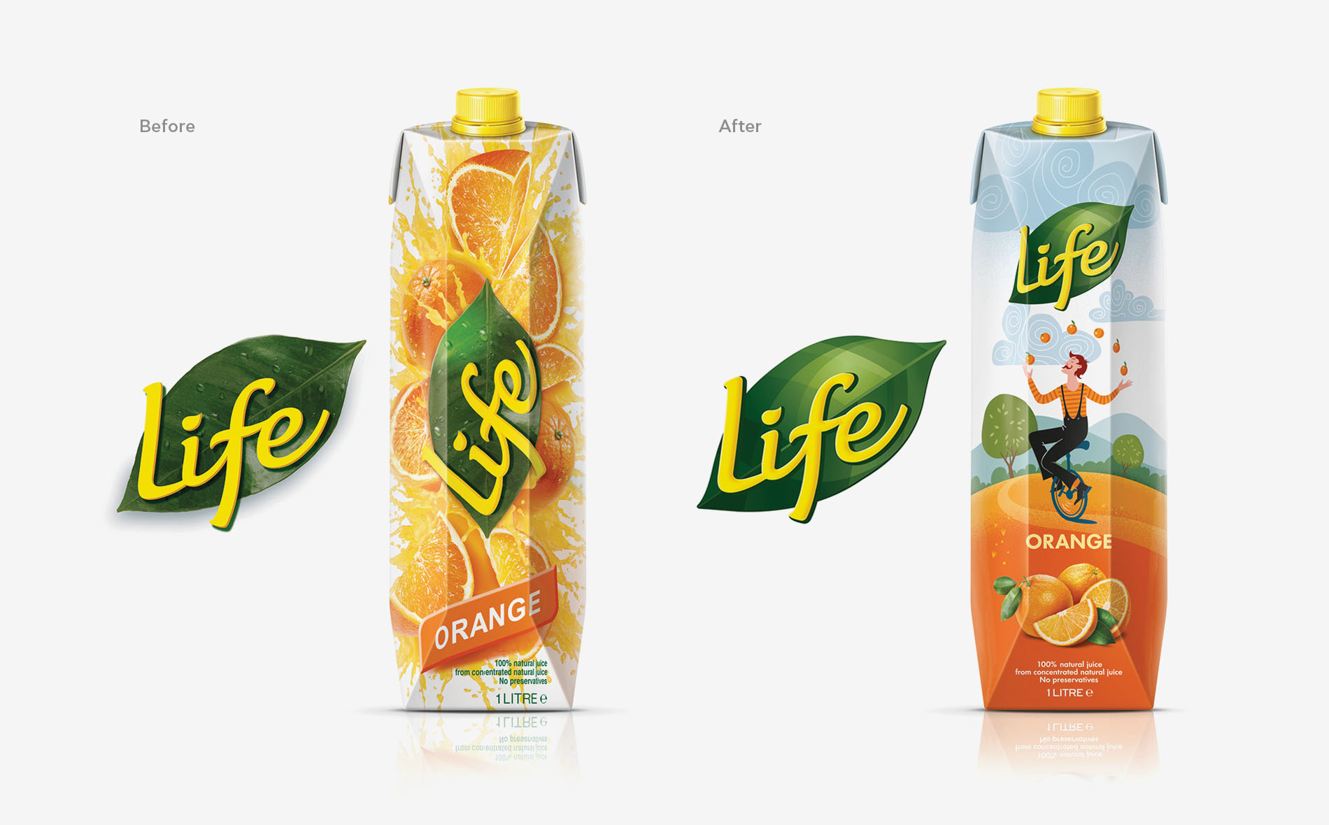
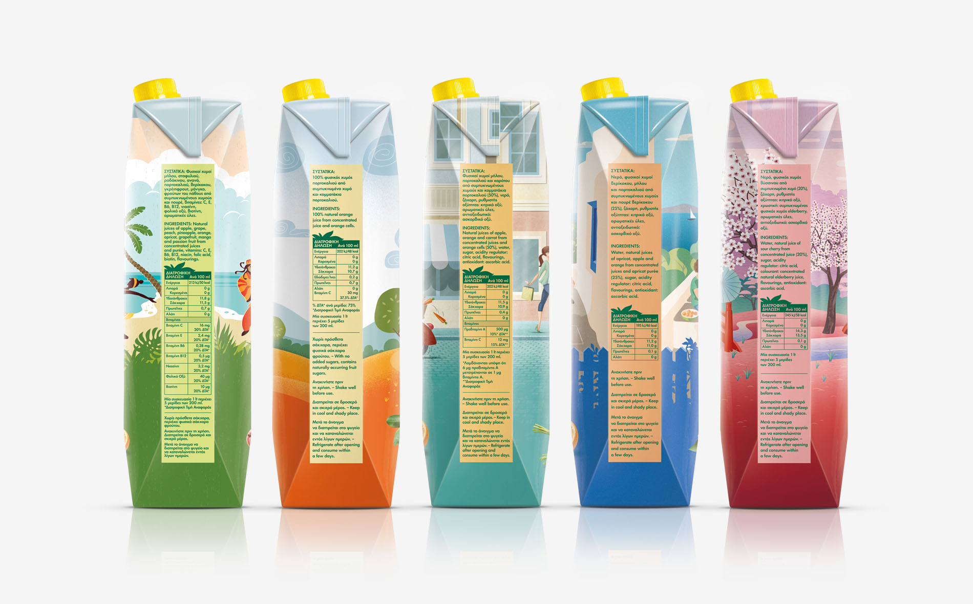
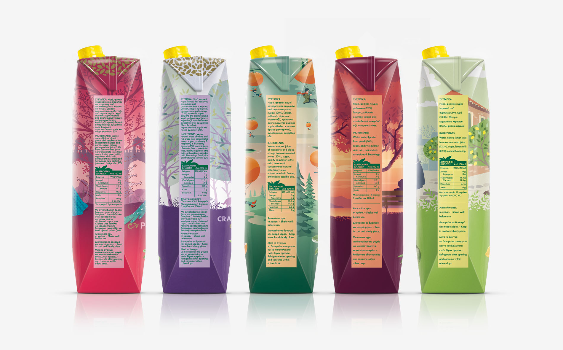
The long life range of juices by Life was launched two years ago and had not managed to make its presence felt on the supermarket shelf because it had used all the same design conventions associated with that category eg. pictures of exploding juice and vividly-coloured close-ups of fruit. A further problem was that supermarkets stack the juices on their shelves per flavour, rather than brand. Therefore the Life brand was lost among competitors with stronger shelf presence.
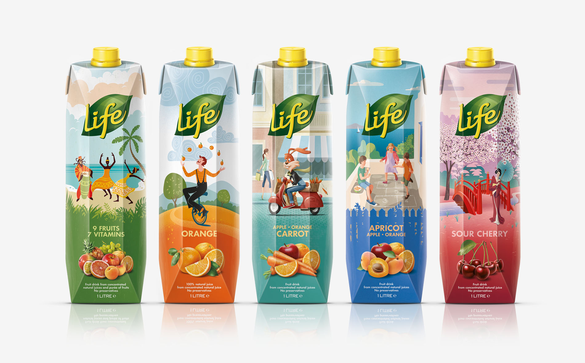
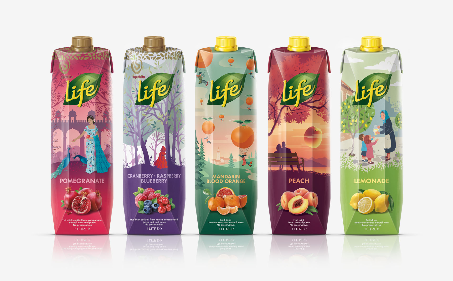
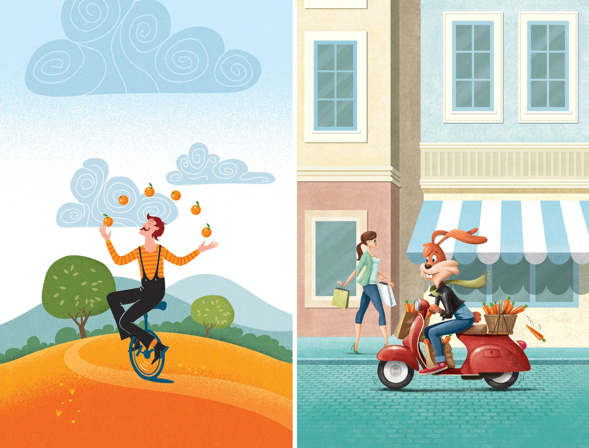
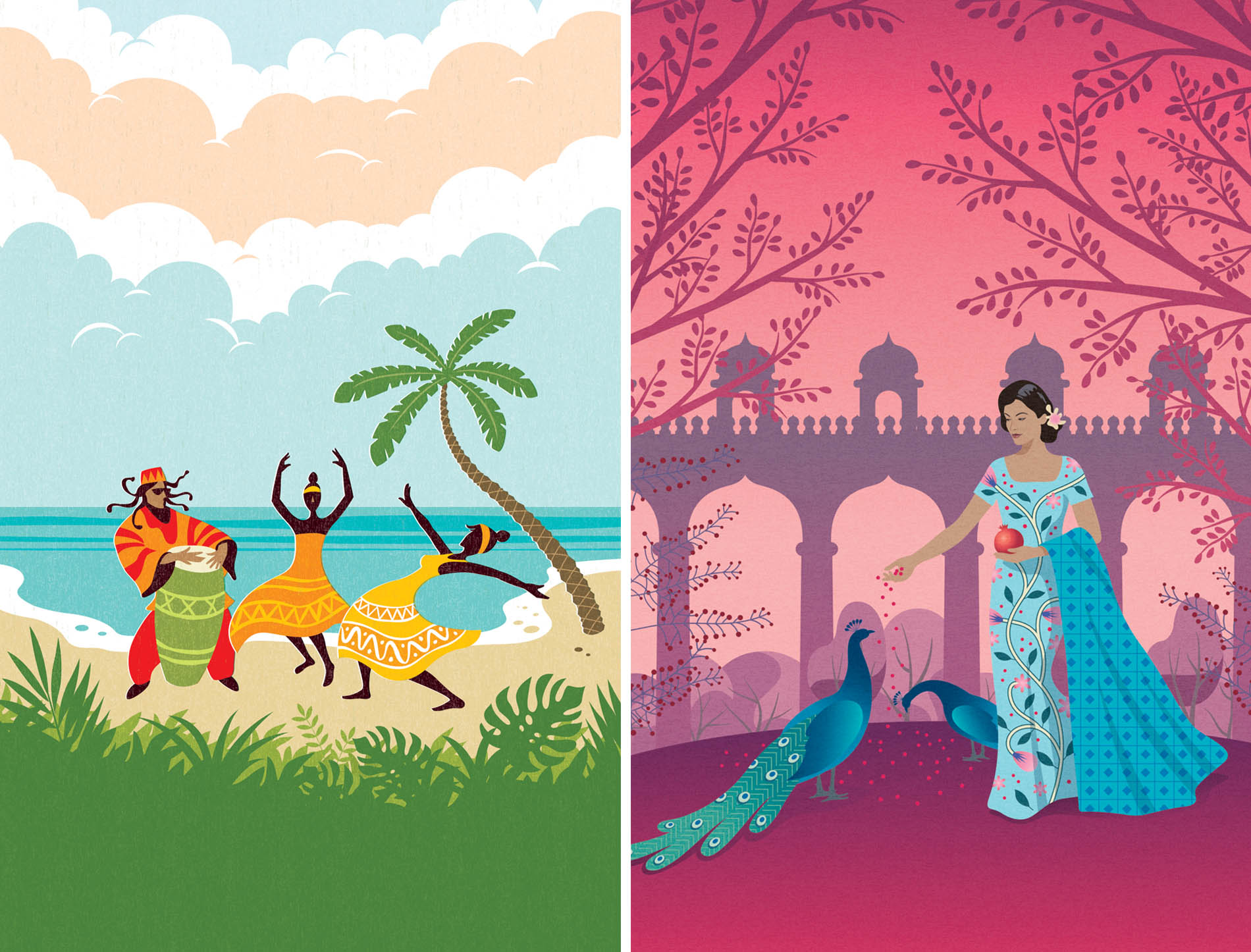
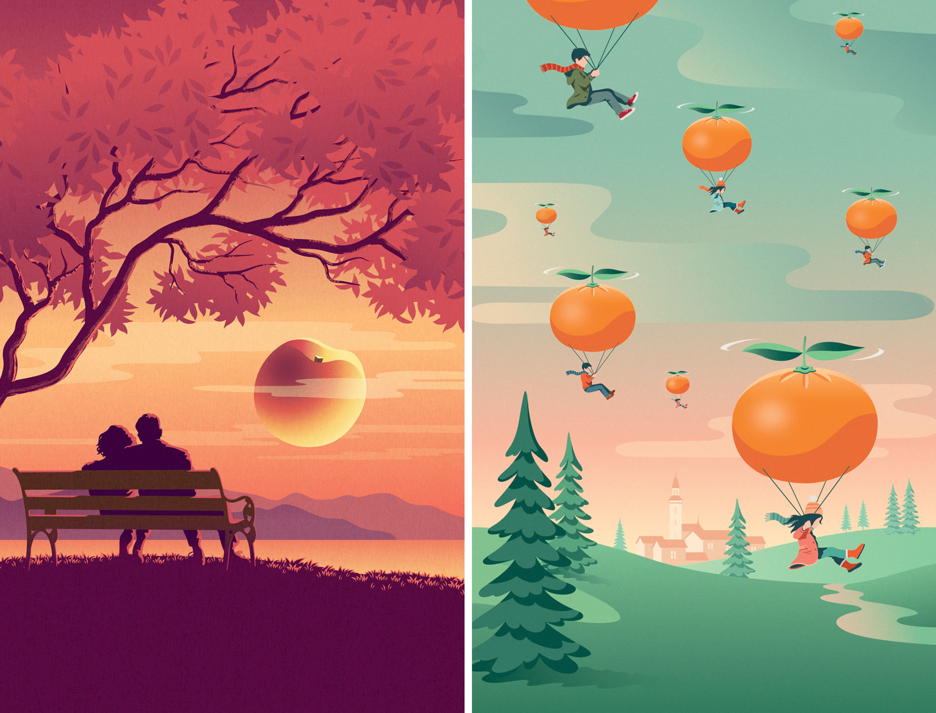
The design brief focused on shelf stand-out through a creative reinterpretation of the conventional design codes. The key idea behind the design was to create visual stories inspired by the fruit and its colour, creating a fresh language on the shelf which catches the consumer's eye, inviting him to discover the story unfolding before him and therefore distinguish the Life brand from its competitors. The brand design has also led to communication which exploits the visual storytelling on the juice cartons.