The Secret Garden
Branding, Graphic Design
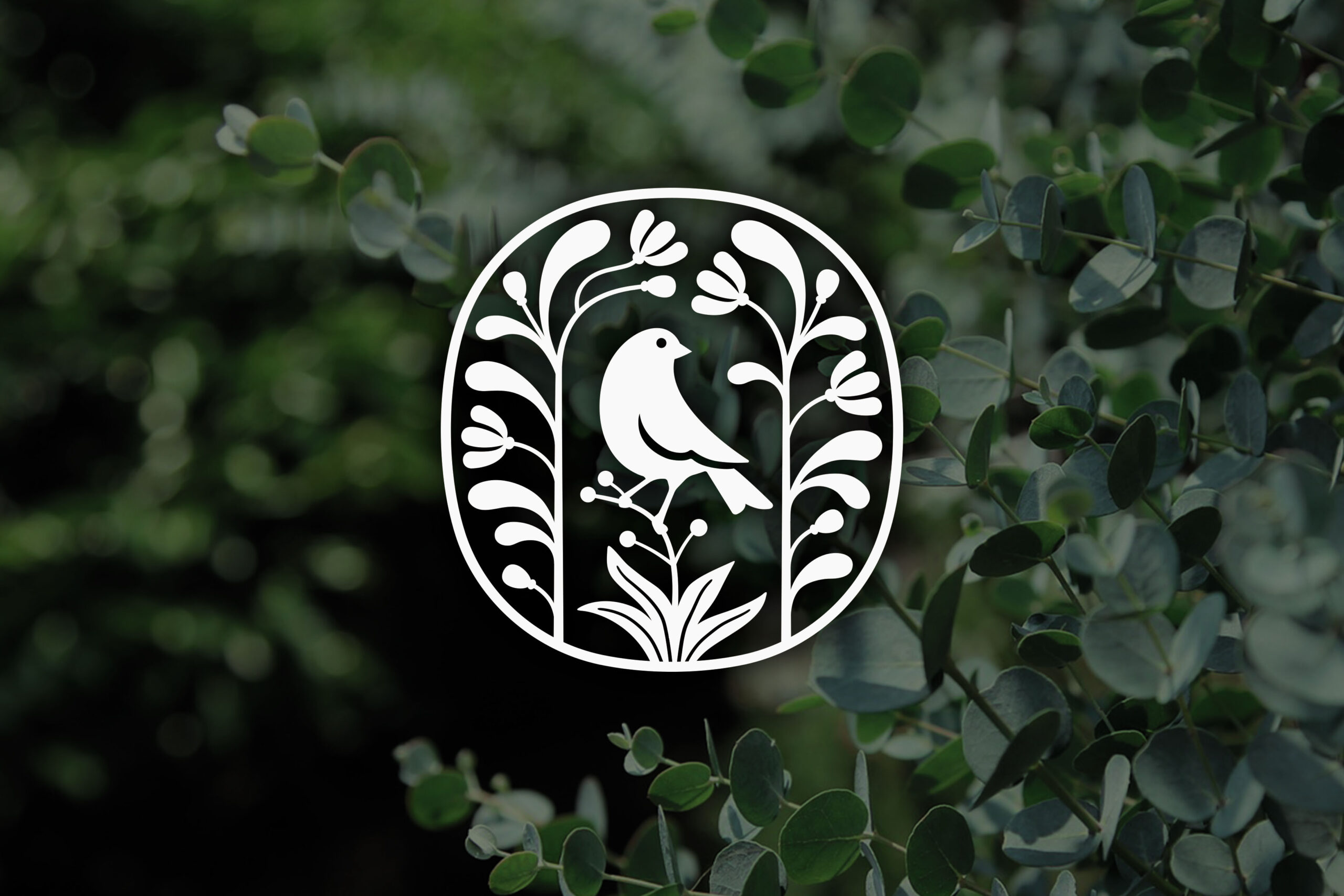
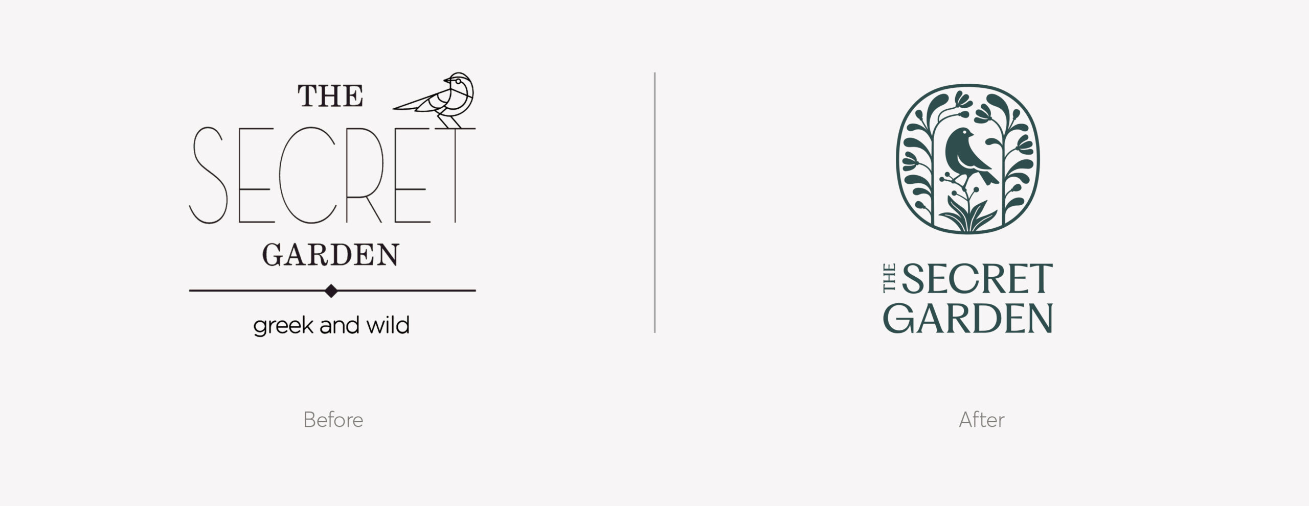
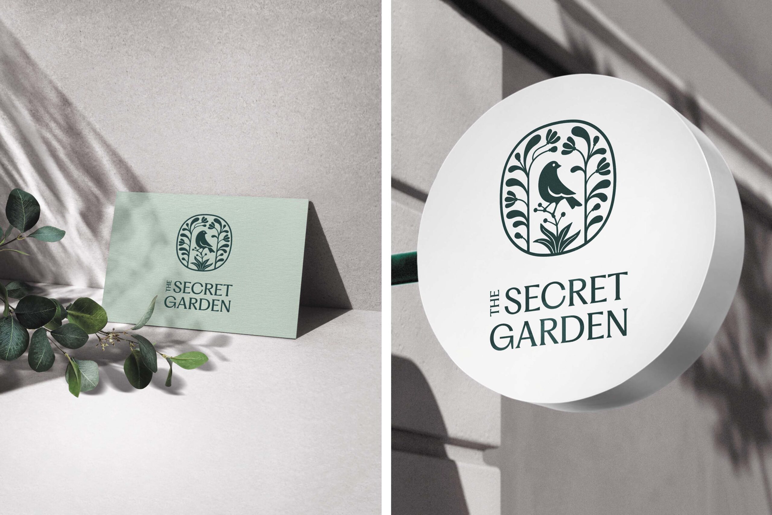
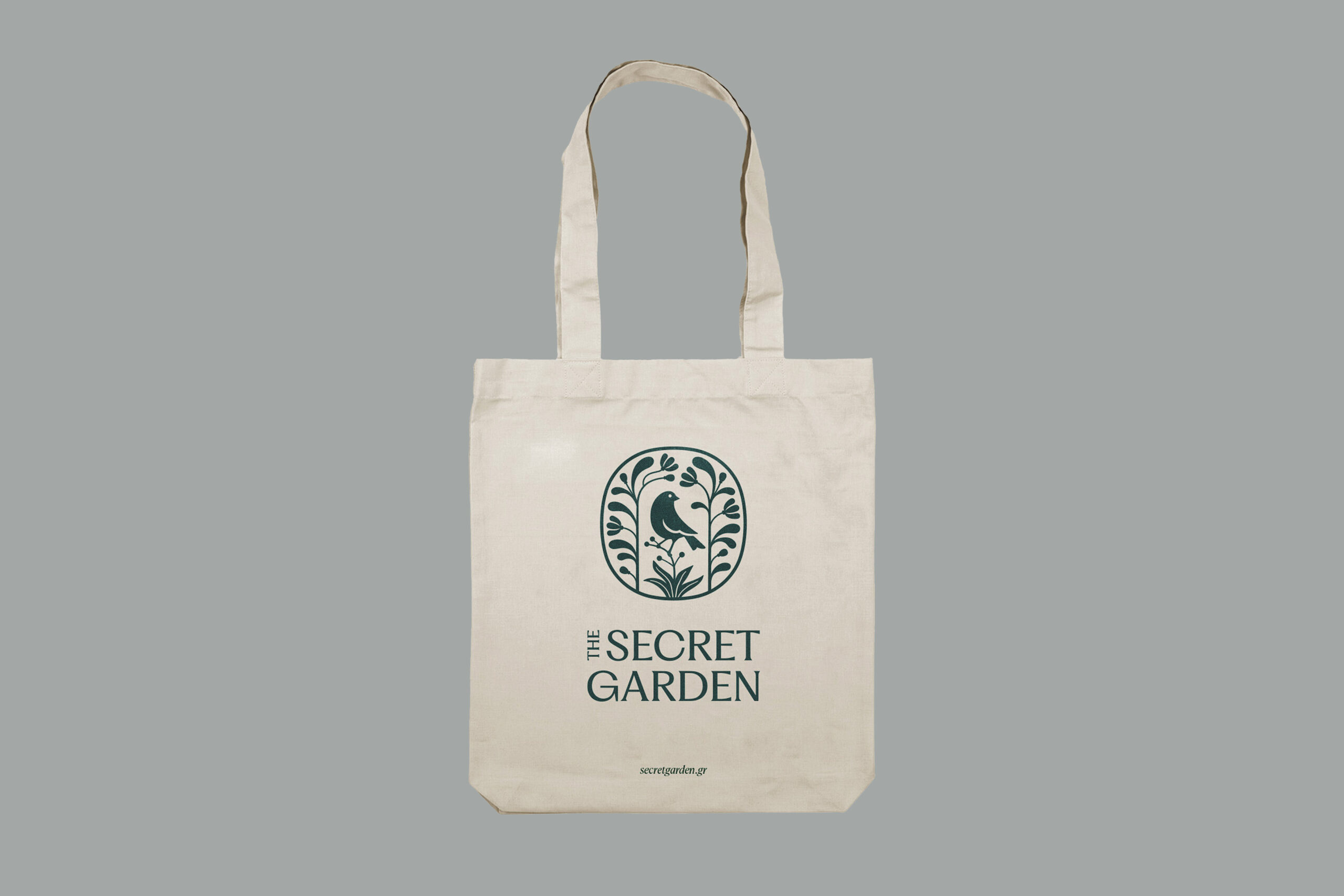
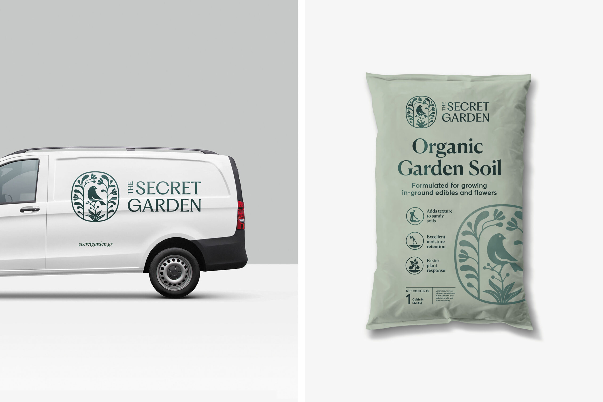
This is a proposal for the logo design of a company that specializes in the creation of original floral arrangements. The fundamental requirement was to somehow retain the design of a bird, which was the central element of the logo preceding this one.
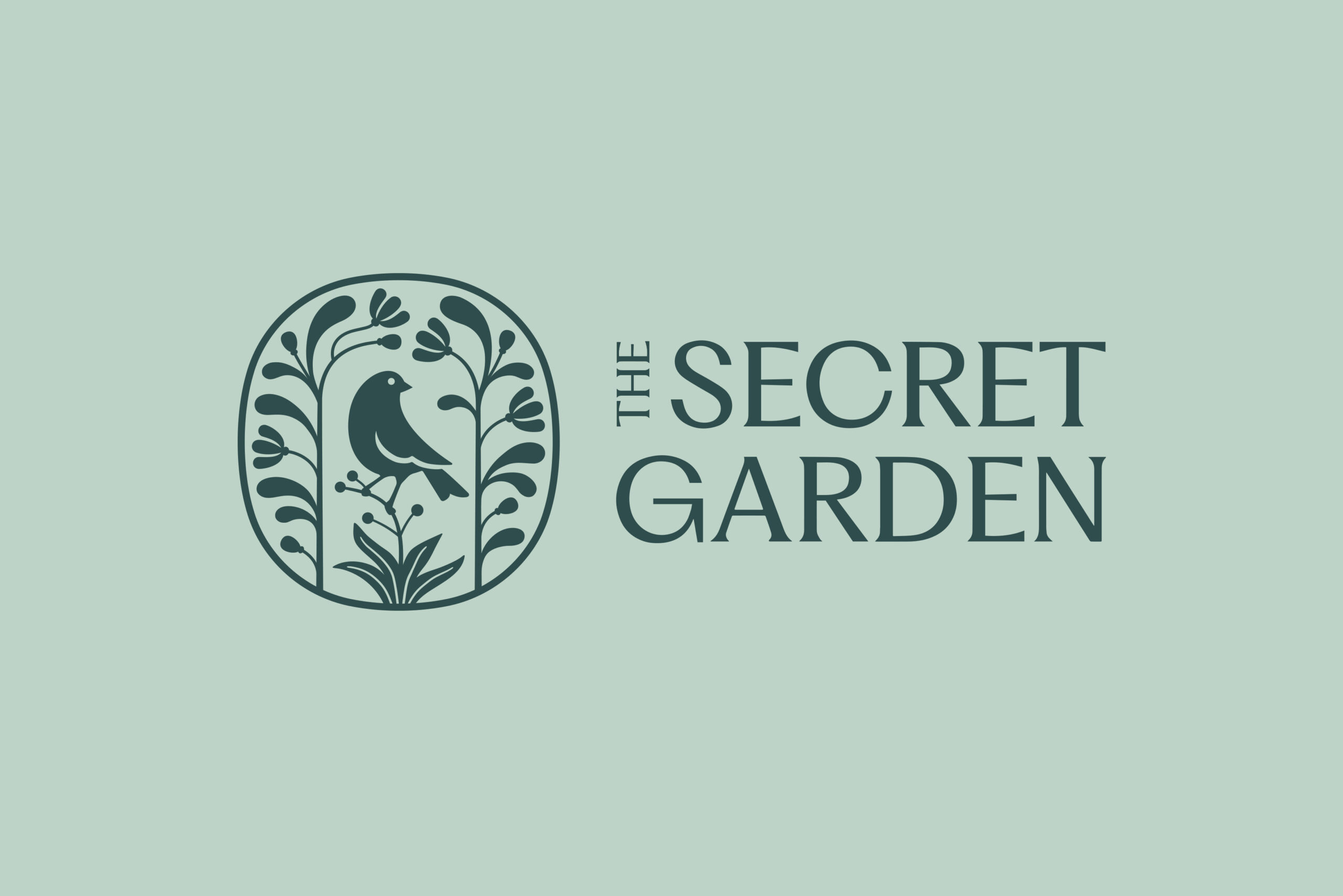
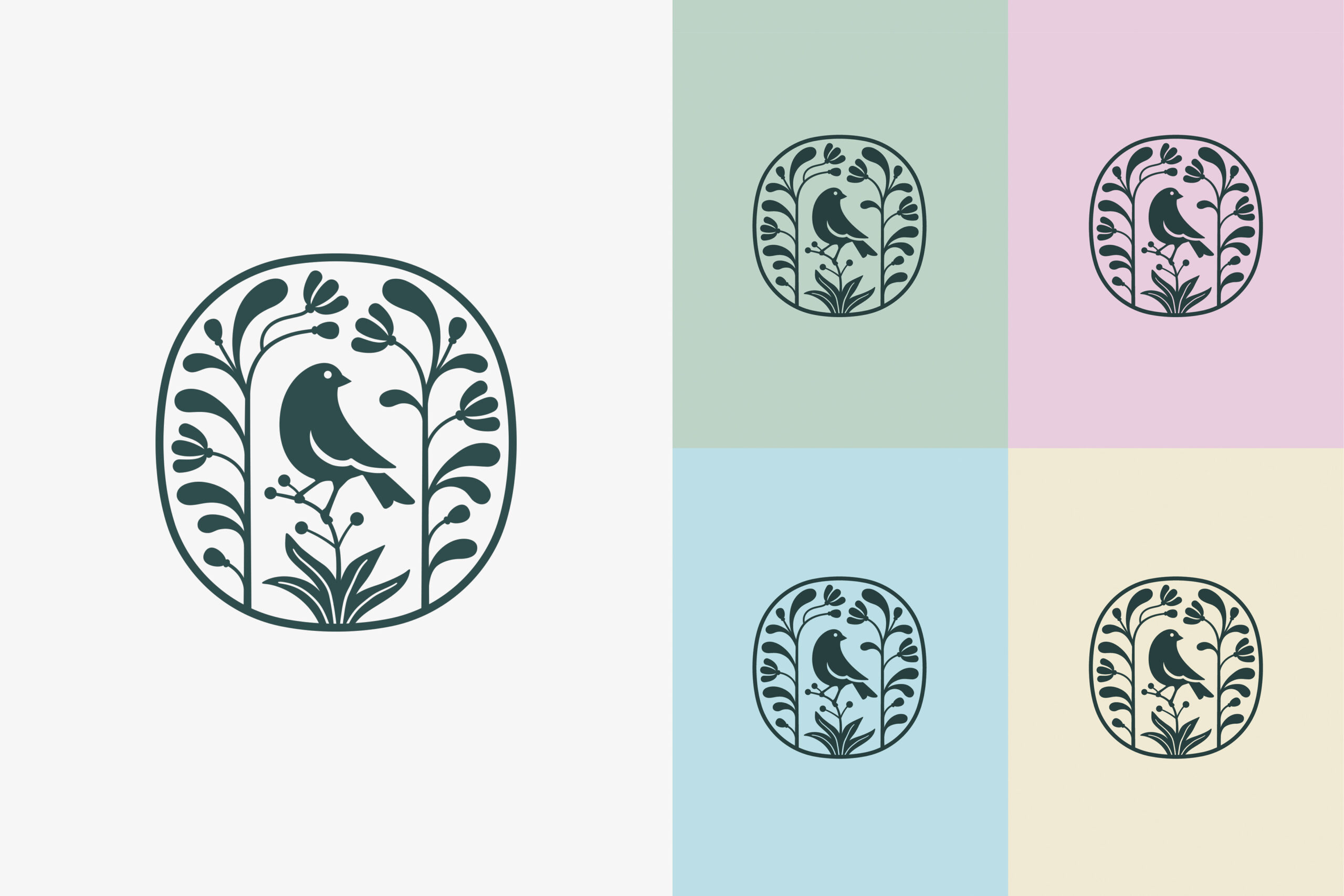
We decided to adopt a classic, robust and time-honored approach. And the basic aim was for the logo to reflect the style of this particular business. Yet, the same logo should be versatile enough to use for branding of bagged products such as compost-based soil.
The basic idea effectively emerged from the very name of the company: the bird, as a dominant element of the design, invites us to enter a hidden garden of plants and flowers.
Finally, a serif font with a more modern character was selected to balance out the slightly austere nature of the composition.